Monday, 31 October 2011

Choosing the Right Chart Notes


Choosing the Right Chart


Spreadsheets may be great for analysing data but rows and columns of figures may not tell the story very effectively. Above is some data about how confident staff at institutions surveyed, in various age groups, feel about using different applications and equipment. The ‘Benchmark’ is the level expected for their roles. It’s not terribly obvious at first glance what these results mean.

The chart below, however, makes it much clearer.


The under 25s are generally pretty confident whilst the 45-54 group would benefit from some training in finding and utilising images effectively. Similar charts could be produced for the other categories.

Not all charts would work though.


This pie chart, for instance is pretty meaningless!


The line graph looks OK at first glance. However, joining the dots imples that there are people between, say, the 35-44s and 45-54s with a level of about 2.7. There is no data for this. In fact, in this example, there couldn’t actually be anyone between 44 and 45 as only ages in years are included!


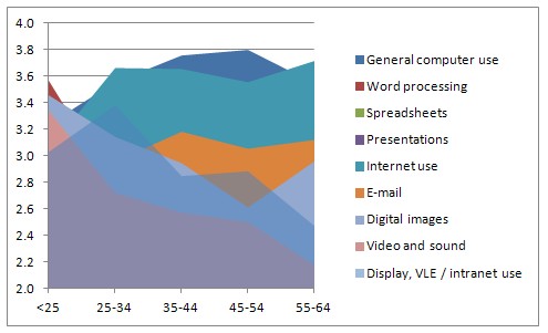
This area chart looks impressive and could, perhaps, with a bit of work, be made to make some sense but the Word Processing level data has been almost completely obscured.


A bar chart, however, could be very illustrative, especially with the use of appropriate colours and, in this example, the vertical axis has been shifted to the ‘Benchmark’ position (2.9 in this case) so some can be seen as behind and others ahead. A column chart would work well too.

In general 
Pie charts show distribution of things within a whole set of data, or the composition of something or compares the size of items making up the whole. They can be good for showing proportions – for example, an illustration of the spread of chosen colours of new cars.

Column charts compare data. They have many uses and can provide meaningful illustrations nearly all the time.

Bar charts are really the same as column charts (and often column charts are called bar charts too!). They show data horizontally which can be better for progress or time-related things.

Line graphs are excellent for showing how results change over time or where there is a continuous flow of data. It is important, though, to be careful about whether you can ‘join the dots’ – is there actually any data that could fit in between one and the other? Even if there is, can you be sure that the line doesn’t leap up or down to that intermediate value instead of the gradual flow that joining the dots implies.

If in doubt, don’t join the dots.

There are lots more but these will cover most needs. 

Presenting Information with Charts Task Sheet

Presenting Information with Charts


Spreadsheets may be great for analysing data but rows and columns of figures may not tell the story very effectively. Above is some data about how confident staff at institutions surveyed, in various age groups, feel about using different applications and equipment. The ‘Benchmark’ is the level expected for their roles. It’s not terribly obvious at first glance what these results mean.

The chart below, however, makes it much clearer.


The under 25s are generally pretty confident whilst the 45-54 group would benefit from some training in finding and utilising images effectively. Similar charts could be produced for the other categories.

Not all charts would work though.

1. Your task is to create suitable charts for each of the 9 skill categories in the data above. They do not need to be blobs like this illustration but you do need to check that the type you have used does actually show sensible and meaningful comparisons between each age group for each skill.

2. Label the chart suitably with a title ‘Using [Skill]’ and ‘Confidence level’ on whichever axis you have used for the scores. There should be clear identification of the different age groups.

3. Either add a line or use colours (or both) to show whether each age group’s score is below, at or above the ‘Benchmark’ figure.

4. Copy the charts you create to a document (as small images) or presentation (as larger images) and ensure that all your files are saved.

5. For one of the 9 skills (your choice), create an alternative type of chart to display the data. Add this to your document or slideshow together with your summary of which type you feel illustrates the data best.

Output

Data table

Charts type 1 with labels

Adjustments to include visual comparison to a Benchmark

Document or slides with charts

Chart with alternative display

Summary of reasons for display

Tuesday, 27 September 2011

Notes for Task 1B

This is required only for the D1 criterion. It's worth doing, though, if you want to get to grips properly with spreadsheets and what they can do.

You will have already come up with some examples of how spreadsheets can be useful in general but now you need to bring out the heavier guns with illustrations of how formulae work (and we're not talking about the simple SUM + - * and / here!)

The sort of formulae or features you illustrate depends on the type of anaylsis you are doing. The list below are some that are really useful and not too complicated ones:


  • VAT calculations (including the more difficult one of working out how much VAT is included in a price)
  • using data stored on one sheet (or entered by a user) in calculations on a second sheet which then display the result on either a third sheet or next to where they entered it. (That always goes down well!)
  • MIN or MAX (shows which value is the lowest or highest in a selection)
  • Validation techniques (and nice or nasty messages that pop up when they enter something they shouldn't)
  • Things that change colour depending on their value when data is entered that affects them
  • IF
  • nested IF statements (the formuale look awful but are so useful)
  • VLOOKUP (or HLOOKUP) get a value from a table and stick it somewhere else or use it in a calculation (eg for an insurance quote look up the car's insurance group in a table and then apply a particular premium based on another table of ages etc.)
  • MROUND often overlooked but this will round horrible looking figures to easy to understand ones - eg 34666 could be displayed as 35000 to the nearer 1000 or 98 as 100 to the nearer 100. Often end users only want an approximate guide and, after lots of assumptions and guesswork about predictions, a figure to seventeen decimal places is pretty irrelevant.
  • SUMIF adds up just those bits you need
  • COUNT counts cells with things in them
  • COUNTIF counts cells with just certain things in
  • LOWER changes text to lower case letters
  • UPPER changes text to UPPER CASE LETTERS
  • PROPER Changes Text To This Sort Of Display (really really useful for names and addresses where some idiot has just stored the data in capitals.
  • RANK puts things in order
  • Conditional formatting changes the colour of text or cells depending on their content
  • NOW() gives you today's date
  • Filters and sorting tools get rid of things you don't want and put the rest in order
  • Hidden rows and columns can do lots of intermediate calculations then go away and leave just the answer without confusing everyone
  • Hiding row and column headers, tabs and even more can make your spreadsheet look nothing like a spreadsheet
  • Protection stops people messing up those long formulae you spent hours getting right.
  • Good alignment, use of correct decimal places, decent fonts and shading rather than lots of grid lines can also immensely impove the appearance of items for publication or display
  • Publishing on the web or as a Live or Google document can be amazingly valuable when collaborating with others on collecting data
  • Using the spreadsheet as a form that people fill in on-line

The list goes on... but that should do for now. You need to make some examples of some of these at work. I'll include a link to some data when I've found some for you to work with.


Examples for Task 1A

Business budget or cash flow forecast

  • sales, how they relate to times of the year or location
  • finance needs, eg does the business need an overdraft? when, how much
  • charts to illustrate changes


Sports league tables


  • recording results
  • Automatic updating of leader board
  • export of table for magazine or web


Marketing


  • Mail shots to selected customers
  • Using filters to select people in an area, certain age etc
  • merge with Word procesed docs
  • Customer information, sales in the past, things they've viewed on web sites


Student records


  • Attendance, progress
  • Comparison with initial targets
  • Results
  • Funding information for College

Sunday, 31 December 2006

Introduction to the unit

Spreadsheets are key software for many businesses and organisations, helping them to keep track of numerical information and analyse it quickly and more easily than with paper records. Accounting and finance use spreadsheets to record the transactions made by organisations. They have replaced manual pages in ledgers, where income and expenditure are organised into rows and columns. Users can make use of inbuilt functionality to help them to understand the data without needing specialist mathematical skills. Utilities such as ordering, sorting and filtering will show the same data in different ways. Charts and graphs help to display information more visually. Complex calculations can be carried out using library functions or users can choose to create their own formulae. One of the main advantages of spreadsheet software is that it can be customised with buttons and macros. IT practitioners can use many features, for example to restrict user access to whole workbooks, spreadsheets or parts of spreadsheets.

Spreadsheets can be saved in a number of different formats. The most useful format is comma separated value (csv), as this particular format can be read by many applications which means that data created in one type of spreadsheet software can be exported easily to other programs. This technology enables organisations to be more knowledgeable about their own activities. This, in turn, allows managers to make decisions more quickly which can lead to organisations gaining competitive advantage.

As IT practitioners, learners will need to be able to use spreadsheet software competently as well as being able to support users as part of a technical or helpdesk role.

Learning outcomes
On completion of this unit a learner should:

1 Understand how spreadsheets can be used to solve complex problems

2 Be able to develop complex spreadsheet models

3 Be able to automate and customise spreadsheet models

4 Be able to test and document spreadsheet models.