Choosing the Right Chart

Spreadsheets may be great for analysing data but rows and columns of figures may not tell the story very effectively. Above is some data about how confident staff at institutions surveyed, in various age groups, feel about using different applications and equipment. The ‘Benchmark’ is the level expected for their roles. It’s not terribly obvious at first glance what these results mean.
The chart below, however, makes it much clearer.

Not all charts would work though.

This pie chart, for instance is pretty meaningless!

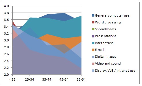
This area chart looks impressive and could, perhaps, with a bit of work, be made to make some sense but the Word Processing level data has been almost completely obscured.

A bar chart, however, could be very illustrative, especially with the use of appropriate colours and, in this example, the vertical axis has been shifted to the ‘Benchmark’ position (2.9 in this case) so some can be seen as behind and others ahead. A column chart would work well too.
In general
Pie charts show distribution of things within a whole set of data, or the composition of something or compares the size of items making up the whole. They can be good for showing proportions – for example, an illustration of the spread of chosen colours of new cars.
Column charts compare data. They have many uses and can provide meaningful illustrations nearly all the time.
Bar charts are really the same as column charts (and often column charts are called bar charts too!). They show data horizontally which can be better for progress or time-related things.
Line graphs are excellent for showing how results change over time or where there is a continuous flow of data. It is important, though, to be careful about whether you can ‘join the dots’ – is there actually any data that could fit in between one and the other? Even if there is, can you be sure that the line doesn’t leap up or down to that intermediate value instead of the gradual flow that joining the dots implies.
If in doubt, don’t join the dots.
There are lots more but these will cover most needs.
No comments:
Post a Comment