Monday 28 November 2011

Choosing the right chart task


Choosing the right chart

In this task you will be deciding which type of chart is most suitable to display all of parts of the various figures shown.

1. How people spent their time!

Make a chart to show how one of these people spend their time.


Make a chart to compare how much time all 5 people spend on eating.

Make a chart to compare how each person's day is spent.

2. Student results

Make a chart to compare how these 5 students did in each subject.

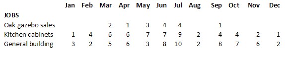
3. Progress with jobs


Make a chart to compare how these 5 people are progressing with the three jobs they have to do.
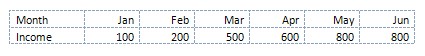
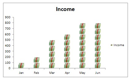
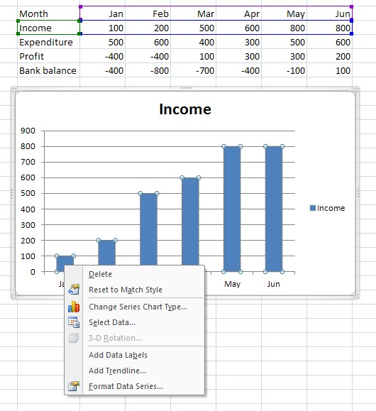
4. Profit and loss
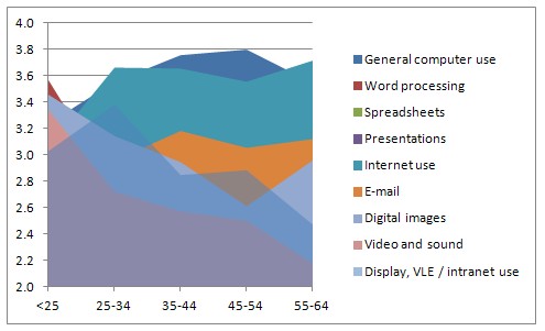
[Click to enlarge this chart so you can read the data]

Make a chart to show the profit or loss for each month. Illustrate the difference between loss and profit months with a colour or effect.

Make a chart to show how the bank balance changes over the year.

Changes colours, fill effects, lines etc. to make these charts more attractive and clear. Make the final set of charts full size displays on their own sheets.

Name the sheets suitably and save the spreadsheet file.

Sunday 27 November 2011

How to make pictographs

Presenting information using pictographs 

This is a way to display numeric information in an interesting way. It is a variation of a column or bar chart.

So instead of giving someone this type of information

You can show them this


Each bundle of notes represents 100.

How to make a pictograph in Excel (2007 or later)
1 Select the data required for a chart

2 Insert a bar or column chart (simple 2-D type)

3 Use whatever colours are provided and right click on any bar


4 Choose Format Data series.


5 In this panel choose Picture or texture fill, and Stack and Scale.

6 You will also need to choose an image to be used. Unless you already have something suitable, use the Clip Art option and search for an image. This can be changed later if you want to replace it with a better icon or picture from the web.

7 There are then three choices: Stretch, Stack, and Stack and Scale. The first, Stretch doesn’t usually work that well as it will make your image look strange! The best option is usually Stack and Scale where you also have to set a number for how many each image will represent. For example if you have small numbers in your data, like 2, 5 6, 11 then 1 unit per picture will work fine. If you have large numbers like 20000, 50000, 60000, 110000 then a unit of 10000 per picture would be better. In this example 100 units per picture has been used.

You may need to try a few different choices and see what works best with your data.


A different symbol has been used.


A change of scale is illustrated above. Note that in this option Excel will cut the image as appropriate where there an exact number will not match the data figures.

Monday 7 November 2011

Peter's budget tasks


Peter is a carpenter. He makes kitchen cabinets and also does general building work. He is planning to introduce a new product – oak gazebos which are like permanent wooden tents people can have in their garden.


Your task is to help him work out how his cash flow will change over the year for different numbers of jobs that he hopes to get.

You are provided with a spreadsheet that has been partially completed. Download that at this link and save it.

1. You will need headings for the other months. Add February to December. (Remember, there is an easy way!)

2. Add a formula in cells G5 to G7 which will show the profit on each type of job. (Ignore other expenses at this stage, just take the cost away from the price)

3. Add the number of jobs he expects to get each month from this table.


4. Enter a formula to show the total number of jobs each month

5. Enter a formula to enter the income for January from each type of job. This will be the job price x number of jobs

6. Show the total income figures in row 20, the sum of the three figures above

7. In the Expenditure section, the cost of the Oak timber will be the number of Oak gazebo jobs x the Oak gazebo cost. Similarly, you can enter formulae to show Kitchen cabinet materials and General building costs.

8. Wages are for someone to help with the building jobs. He pays £100 per building job

9. The other expenses, drawings to sundry expenses, can all be assumed to be the same each month. Use either a formula or other method to copy these across.

10. Show the total expenditure figures in row 38.

11. The monthly profit will be his total income – total expenditure

12. The bank balance for January is entered already. From February it will be January’s balance + February’s profit. That formula can be copied for the other months.

13. Create a chart that shows Peter’s total jobs each month

14. Create a chart that shows his profit or loss for each month. Change the colours displayed so that the months with a loss stand out (eg profit in green, loss in red)

15. Create a chart that shows how his bank balance will change over the year.

16. Create three charts which indicate the cost and profit components of each type of job, expressing each as a percentage.

17. Copy the spreadsheet and display the formulae used.

Peter now wonders what would happen if he had to take July off too and would not be able to do any jobs that month. He realises that he will have to reduce his monthly drawings (what he pays himself each month) as it is important that he does not go overdrawn in December. By changing his monthly drawings determine the most he can pay himself each month and still be in the black at the end of the year.

Keep a separate copy of the chart showing this.

Output
  • Sheet with complete data entered 
  • A chart of total jobs each month 
  • A profit and loss chart 
  • A bank balance chart 
  • Job cost / profit charts 
  • Formulae sheet 
  • Effect of July holiday and lower drawings chart

Sunday 6 November 2011

Help with the Peter spreadsheet


Ideas!
1.       Entering months

drag the little black box at the corner across and the months will just appear
2.       Add a formula in cells G5 to G7 which will show the profit

=B5-E5 will work for Oak gazebo profit. That formula can be copied down with the same little black box for the other two.

3.       Add the number of jobs he expects to get each month from this table.
Just type in the right cells

4.       Enter a formula to show the total number of jobs each month
=SUM(B11:B13) will add the right figures for January. Again, copy across for other months

5.       Enter a formula to enter the income for January ..
You need to make sure the formula always uses the same Price for Oak gazebos. So use =$B$5*B11 (with those $ signs). That can then be copied across. It’s 0 for some months.
=$B$6*B12 will work for kitchens
=$B$7*B13 will work for building

6.       Show the total income figures in row 20, the sum of the three figures above
=SUM(B16:B19) will add the income for January and can be copied across

7.       In the Expenditure section, the cost of the Oak timber will be the number of Oak gazebo jobs x the Oak gazebo cost. Similarly, you can enter formulae to show Kitchen cabinet materials and General building costs.
=$E$5*B11 (with the dollar signs) is needed for January and can then be copied
=$E$6*B12 for kitchens
=$E$7*B13 for building

8.      Wages are for someone to help with the building jobs. He pays £100 per building job
=B13*100 will work and can be copied

9.       The other expenses, drawings to sundry expenses, can all be assumed to be the same each month. Use either a formula or other method to copy these across.
10.   Show the total expenditure figures in row 38.
Another Sum formula =SUM(B23:B37) will work and can be copied

11.   The monthly profit will be his total income – total expenditure
=B20-B38 will work and can be copied

12.   The bank balance for January is entered already. From February it will be January’s balance + February’s profit. That formula can be copied for the other months.
Put =B40 in the January balance column.
=B42+C40 will then work for February and can be copied across

13.   Create a chart that shows Peter’s total jobs each month
Highlight from A9 to M9 (the months row) then hold the Ctrl key and highlight A14 to M14
Then try Insert>Chart and choose a column type

14.   Create a chart that shows his profit or loss for each month. Change the colours displayed so that the months with a loss stand out (eg profit in green, loss in red)
again, start with A9 to M9, hold Ctrl and highlight A40 to M40
Then Insert >Chart and choose a column type
To change any bar colour, click any bar once and then click again so just one is selected
You can use the Fill or Shading button on the home toolbar to pick a colour. Repeat for others to be changed.

15.   Create a chart that shows how his bank balance will change over the year.
Select A9 to M9, hold Ctrl and then select A42 to M42
Insert>Chart and select a line type

16.   Create three charts which indicate the cost and profit components of each type of job, expressing each as a percentage.
Select A5, E5 and G5 using the Ctr method to skip other cells.
Insert>Chart and choose a pie chart

17.   Copy the spreadsheet and display the formulae used.
To copy the sheet, point to its tab with the mouse and then hold the Ctrl key down while you drag the tab to the right, release the mouse, then the Ctrl key. That should make a second copy with (1) after the tab name.
To show formulae use Ctr+` (the key to left of 1 on most keyboards). Don’t worry if the sheet looks odd!


Monday 31 October 2011

Choosing the Right Chart Notes


Choosing the Right Chart


Spreadsheets may be great for analysing data but rows and columns of figures may not tell the story very effectively. Above is some data about how confident staff at institutions surveyed, in various age groups, feel about using different applications and equipment. The ‘Benchmark’ is the level expected for their roles. It’s not terribly obvious at first glance what these results mean.

The chart below, however, makes it much clearer.


The under 25s are generally pretty confident whilst the 45-54 group would benefit from some training in finding and utilising images effectively. Similar charts could be produced for the other categories.

Not all charts would work though.


This pie chart, for instance is pretty meaningless!


The line graph looks OK at first glance. However, joining the dots imples that there are people between, say, the 35-44s and 45-54s with a level of about 2.7. There is no data for this. In fact, in this example, there couldn’t actually be anyone between 44 and 45 as only ages in years are included!


This area chart looks impressive and could, perhaps, with a bit of work, be made to make some sense but the Word Processing level data has been almost completely obscured.


A bar chart, however, could be very illustrative, especially with the use of appropriate colours and, in this example, the vertical axis has been shifted to the ‘Benchmark’ position (2.9 in this case) so some can be seen as behind and others ahead. A column chart would work well too.

In general 
Pie charts show distribution of things within a whole set of data, or the composition of something or compares the size of items making up the whole. They can be good for showing proportions – for example, an illustration of the spread of chosen colours of new cars.

Column charts compare data. They have many uses and can provide meaningful illustrations nearly all the time.

Bar charts are really the same as column charts (and often column charts are called bar charts too!). They show data horizontally which can be better for progress or time-related things.

Line graphs are excellent for showing how results change over time or where there is a continuous flow of data. It is important, though, to be careful about whether you can ‘join the dots’ – is there actually any data that could fit in between one and the other? Even if there is, can you be sure that the line doesn’t leap up or down to that intermediate value instead of the gradual flow that joining the dots implies.

If in doubt, don’t join the dots.

There are lots more but these will cover most needs. 

Presenting Information with Charts Task Sheet

Presenting Information with Charts


Spreadsheets may be great for analysing data but rows and columns of figures may not tell the story very effectively. Above is some data about how confident staff at institutions surveyed, in various age groups, feel about using different applications and equipment. The ‘Benchmark’ is the level expected for their roles. It’s not terribly obvious at first glance what these results mean.

The chart below, however, makes it much clearer.


The under 25s are generally pretty confident whilst the 45-54 group would benefit from some training in finding and utilising images effectively. Similar charts could be produced for the other categories.

Not all charts would work though.

1. Your task is to create suitable charts for each of the 9 skill categories in the data above. They do not need to be blobs like this illustration but you do need to check that the type you have used does actually show sensible and meaningful comparisons between each age group for each skill.

2. Label the chart suitably with a title ‘Using [Skill]’ and ‘Confidence level’ on whichever axis you have used for the scores. There should be clear identification of the different age groups.

3. Either add a line or use colours (or both) to show whether each age group’s score is below, at or above the ‘Benchmark’ figure.

4. Copy the charts you create to a document (as small images) or presentation (as larger images) and ensure that all your files are saved.

5. For one of the 9 skills (your choice), create an alternative type of chart to display the data. Add this to your document or slideshow together with your summary of which type you feel illustrates the data best.

Output

Data table

Charts type 1 with labels

Adjustments to include visual comparison to a Benchmark

Document or slides with charts

Chart with alternative display

Summary of reasons for display

Tuesday 27 September 2011

Notes for Task 1B

This is required only for the D1 criterion. It's worth doing, though, if you want to get to grips properly with spreadsheets and what they can do.

You will have already come up with some examples of how spreadsheets can be useful in general but now you need to bring out the heavier guns with illustrations of how formulae work (and we're not talking about the simple SUM + - * and / here!)

The sort of formulae or features you illustrate depends on the type of anaylsis you are doing. The list below are some that are really useful and not too complicated ones:


  • VAT calculations (including the more difficult one of working out how much VAT is included in a price)
  • using data stored on one sheet (or entered by a user) in calculations on a second sheet which then display the result on either a third sheet or next to where they entered it. (That always goes down well!)
  • MIN or MAX (shows which value is the lowest or highest in a selection)
  • Validation techniques (and nice or nasty messages that pop up when they enter something they shouldn't)
  • Things that change colour depending on their value when data is entered that affects them
  • IF
  • nested IF statements (the formuale look awful but are so useful)
  • VLOOKUP (or HLOOKUP) get a value from a table and stick it somewhere else or use it in a calculation (eg for an insurance quote look up the car's insurance group in a table and then apply a particular premium based on another table of ages etc.)
  • MROUND often overlooked but this will round horrible looking figures to easy to understand ones - eg 34666 could be displayed as 35000 to the nearer 1000 or 98 as 100 to the nearer 100. Often end users only want an approximate guide and, after lots of assumptions and guesswork about predictions, a figure to seventeen decimal places is pretty irrelevant.
  • SUMIF adds up just those bits you need
  • COUNT counts cells with things in them
  • COUNTIF counts cells with just certain things in
  • LOWER changes text to lower case letters
  • UPPER changes text to UPPER CASE LETTERS
  • PROPER Changes Text To This Sort Of Display (really really useful for names and addresses where some idiot has just stored the data in capitals.
  • RANK puts things in order
  • Conditional formatting changes the colour of text or cells depending on their content
  • NOW() gives you today's date
  • Filters and sorting tools get rid of things you don't want and put the rest in order
  • Hidden rows and columns can do lots of intermediate calculations then go away and leave just the answer without confusing everyone
  • Hiding row and column headers, tabs and even more can make your spreadsheet look nothing like a spreadsheet
  • Protection stops people messing up those long formulae you spent hours getting right.
  • Good alignment, use of correct decimal places, decent fonts and shading rather than lots of grid lines can also immensely impove the appearance of items for publication or display
  • Publishing on the web or as a Live or Google document can be amazingly valuable when collaborating with others on collecting data
  • Using the spreadsheet as a form that people fill in on-line

The list goes on... but that should do for now. You need to make some examples of some of these at work. I'll include a link to some data when I've found some for you to work with.


Examples for Task 1A

Business budget or cash flow forecast

  • sales, how they relate to times of the year or location
  • finance needs, eg does the business need an overdraft? when, how much
  • charts to illustrate changes


Sports league tables


  • recording results
  • Automatic updating of leader board
  • export of table for magazine or web


Marketing


  • Mail shots to selected customers
  • Using filters to select people in an area, certain age etc
  • merge with Word procesed docs
  • Customer information, sales in the past, things they've viewed on web sites


Student records


  • Attendance, progress
  • Comparison with initial targets
  • Results
  • Funding information for College