Presenting information using pictographs
This is a way to display numeric information in an interesting way. It is a variation of a column or bar chart.
So instead of giving someone this type of information
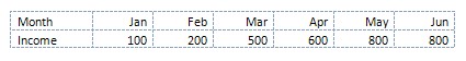
You can show them this

Each bundle of notes represents 100.
How to make a pictograph in Excel (2007 or later)
1 Select the data required for a chart
2 Insert a bar or column chart (simple 2-D type)
3 Use whatever colours are provided and right click on any bar

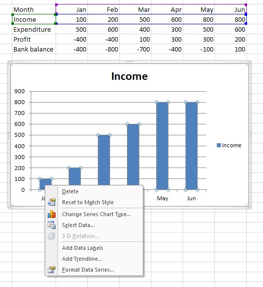
4 Choose Format Data series.


5 In this panel choose Picture or texture fill, and Stack and Scale.
6 You will also need to choose an image to be used. Unless you already have something suitable, use the Clip Art option and search for an image. This can be changed later if you want to replace it with a better icon or picture from the web.
7 There are then three choices: Stretch, Stack, and Stack and Scale. The first, Stretch doesn’t usually work that well as it will make your image look strange! The best option is usually Stack and Scale where you also have to set a number for how many each image will represent. For example if you have small numbers in your data, like 2, 5 6, 11 then 1 unit per picture will work fine. If you have large numbers like 20000, 50000, 60000, 110000 then a unit of 10000 per picture would be better. In this example 100 units per picture has been used.
You may need to try a few different choices and see what works best with your data.


A different symbol has been used.


A change of scale is illustrated above. Note that in this option Excel will cut the image as appropriate where there an exact number will not match the data figures.
No comments:
Post a Comment